You would think choosing a font would be easy… but it’s really not. We first had to think about the aspects of our film and when we would be including text. Due to the structure of the film opening we can’t really implement text into the film wherever we would like because too much will be going on to pay attention to the text. However we did find one really good scene to add the title sequence into. It will be implement in the scene of the drug trade as well as when the coder is working. We chose these scenes because we can implement the text into the computer scene as the coder is working and we can also implement text into the bag which the pill will come in.
However, we still don’t know the font we are going to use. Therefore, we searched for inspiration on the internet. We obviously looked at Deadpool because it is kind of our favorite movie. The font for Deadpool is extremely unique and specific to the type of movie. Therefore, we will not be able to use that many aspects from it.
Due to the fact that the main character is a coder, we can take a lot of inspiration from the Matrix. The green code crossing the screen is something we can use, for it allows us to show it on the screen as the coder works. It also looks like the typical coding sequences with weird characters. This will provide the audience with a strong affirmation of who the character is and what he does. This also leads the audience to think of why the worker is frustrated (Code not working).
)
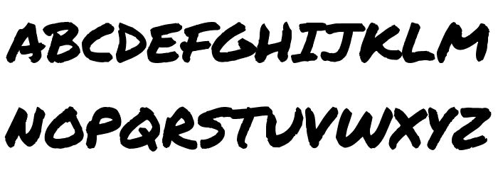
For our final option we needed to find an inspiration for a font which seems handwritten. Due to the fact that we will be including some credits in the baggy where the drug is located we can take advantage and possibly write the title for the movie. Therefore we chose to use the movie poster for Kick-a** or Midnight run. Due to the fact that both give us a font that looks handwritten or man made.